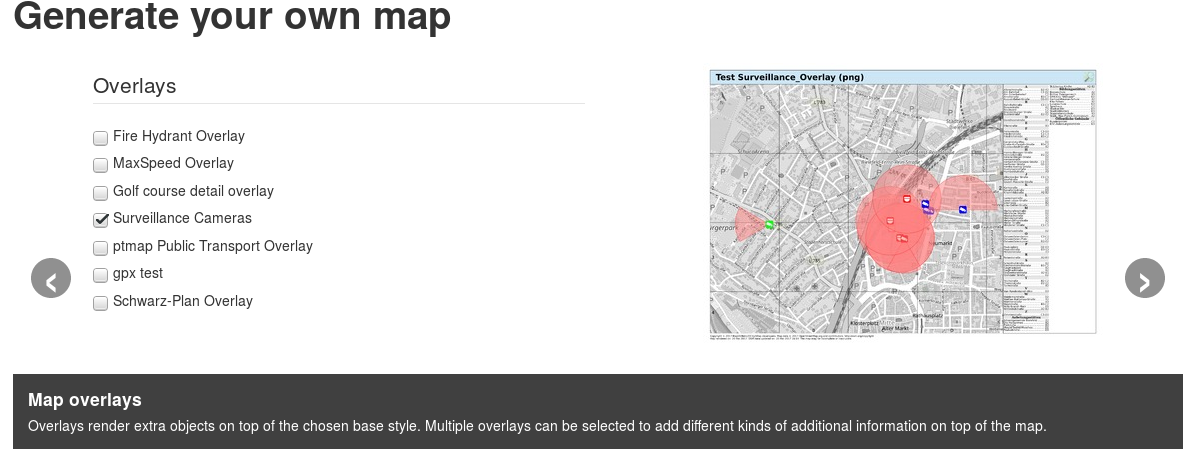
Page layout, render style and overlays no longer need to be chosen blindly, example images are now shown on the side to help chosing the right option.

At the same time the layout, style and overlay lists do no longer share a form frame but have split up into separate form wizzard steps instead.
The preview images do not show the actual selected city or map region, so they only provide a hit how rendered features will look like, not a preview of the actual map.
This should be sufficient as a visual hint to make a more informed decision.
One thought on “UI improvements: style and layout previews”