In recent weeks I have exeprimented with some user interface improvements again. None of these really changed the workflow, so they should be rather intuitive. But I still think that they improve the user experience a little bit.

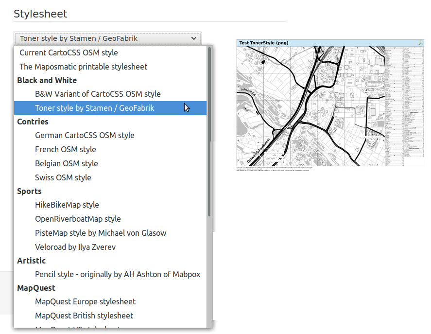
The first change is that the available stylesheets are now presented as a select box with grouped selections, so taking less space than the original radio button list, and at the same time allowing for grouping styles into thematic groups, so providing for some better overview than before.

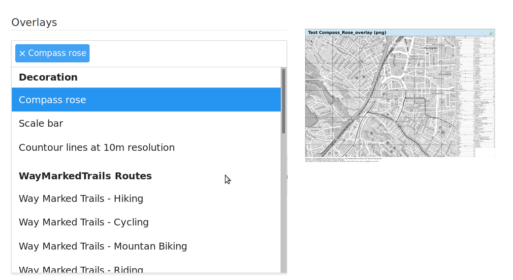
A similar change now also allows for thematic grouping of the various overlays.

And last not least on the map detail page the download button has been replaced with a list of download icons, presenting the same information as before in a more appealing way, and also saving one click per downlaod.
On the map list page the old download button is still in unse though, as there screen space is much more precious.
One thought on “Site improvements”