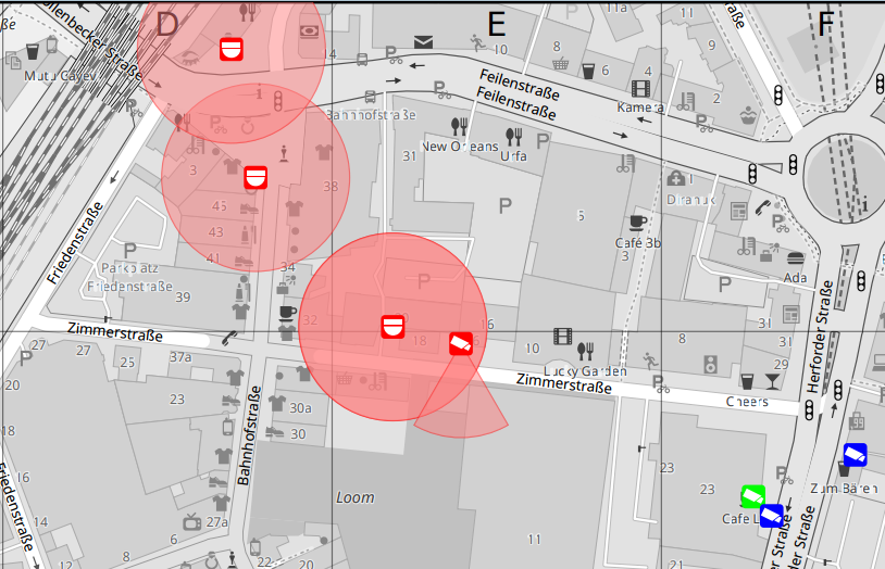
I’ve now added a (mostly) monochrome variant of the CartoOSM style which is especially suitable for use in combination with overlays as it makes colored features from the overlay stand out more prominently.

The style is only mostly monochrome as I can’t simply run the rendered results through an image converter to remove colors completely.
Instead I needed to convert all explicit color settings in the style file into their monochrome equivalent up front so that things get rendered in monochrome right away.
For a complete monochrome result I would also have to maintain converted copies of all shield symbolizer images and all polygon fill patterns. So far I’ve been too lazy for this, but I may consider to do this at some later point when I get to scriptify the stylesheet tweaking process (for this initial test I modified all color values in the style sheet manually …)